Redeveloped workplace behind a retained brick façade, with lightweight, three-storey addition, doubling the usable area.

Vitcorp
Shoreditch, London
£3.3 million
20,000 square feet

“This is a photogenic, eye-catching building and it improves the look and feel of this Shoreditch neighbourhood – home to creative industries by day and a vibrant nightlife. The architect has nearly doubled the amount of usable space on the site and won planning for three more storeys in a conservation area.” Christine Murray, The Architects’ Journal
  • Located in a conservation area of Georgian brick buildings Planning constraints included retention of existing urban block
  • Structural complexity of retaining façade challenged cost and programme
  • Plan dictated by logic and efficiency: compact circulation core on tallest side of building
  • External terraces carved out of Rights of Light envelope
  • Flexible space for single or multiple tenancy
  • Glass and perforated, profiled metal cladding to additional storeys arranged in modules optimised from rhythm of existing facade

Client: Vitcorp
Structural Engineer: Price & Myers
Environmental Design Consultant: Peter Deer & Associates
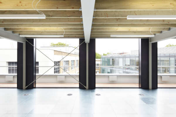
Internal View
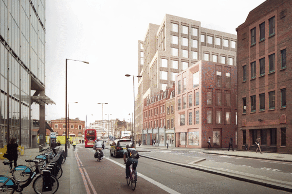
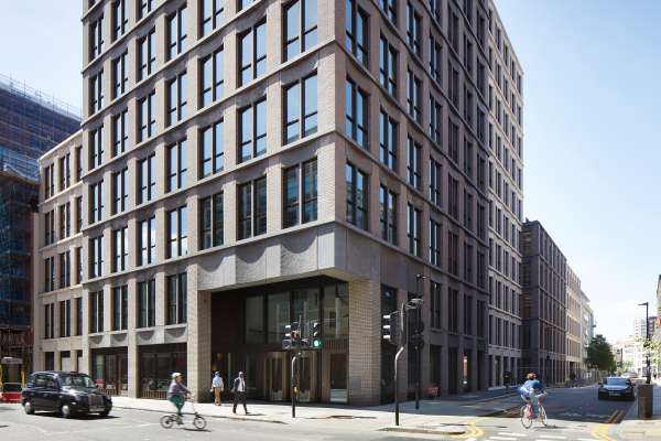
Bedded Within the Context The new modern extension in harmony with the historical context.
Facade Retention Steels are constructed to support the retained first and second floor during the construction of the ground floor.
The Facade Composition A composition of the historic brick neighbouring facade, large format glazing & the lightweight perforated metal skin.
Model Study illustrating the dense historic surrounding context.
Front Elevation The aminated facade comes to life at dusk.
The Facade at Night A model demonstrating the lit up lantern of the new extension.
Cast Model A plaster cast model base provides a testing ground for the lightweight new extension.
Facade Retention Collage of alternative massing, material, window and base options.
Open Studio Testing design options of the new extension.
New within the Existing A sketch elevation looking at the new facade addition within the historic street of Curtain Road.
Horizontal Proportions Testing horizontal proportion of the base, existing and extension.
Facade vs Programme Testing the internal programme and circulation and the relationship with the facade.
Bays and Floors Investigation of the vertical bay rhythm of the existing facade & the number of floors for the new extension.
Initial Facade Design Thoughts Ideas about interlocking blocks and heights of the extension.

Curtain Road